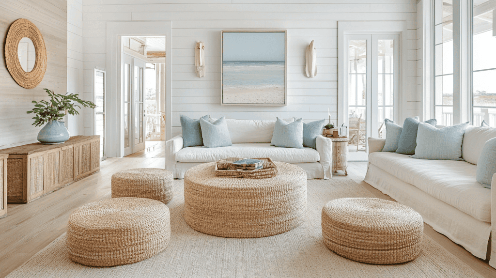
Waterfront living asks for colors that feel sun-warmed, relaxed, and quietly refined. In homes across Annapolis and Arnold, warm coastal neutrals do exactly that—soft beiges, sandy taupes, linen whites, driftwood grays, and clay-tinted creams that play beautifully with shoreline light. Below you’ll find how to choose undertones, balance sheens in humid spaces, and pair walls, trim, and ceilings for rooms that feel cohesive from morning tide to golden hour. For help applying any of these ideas, our team offers professional interior painting tailored to waterfront conditions.
Why warm coastal neutrals work in waterfront homes
- They embrace natural light. Bayside sun can be bright and variable; warm neutrals soften glare while keeping spaces luminous.
- They bridge indoor–outdoor living. Sand, shells, rope, driftwood—the palette ties interiors to the shoreline without feeling theme-y.
- They flex with décor. Whether you lean modern, cottage, or classic, warm neutrals allow art, textiles, and wood tones to shine.
- They calm color reflections. Water and foliage can cast green/blue tints inside; warm bases help keep rooms inviting.
Undertones that flatter Chesapeake light
- Sand-leaning beiges: Think oat, khaki, or dune—great where west light can go brassy; these stay welcoming at sunset.
- Greige with a wink of warmth: A driftwood-gray base warmed by beige keeps spaces airy without going cool.
- Creams with a touch of peach or straw: Cheerful in morning light; ideal for kitchens and breakfast nooks.
- Taupes with clay or mushroom tones: Add depth to living rooms and primary suites without feeling heavy.
Tip: Sample in at least two exposures (water-facing and interior) and check at 8 am, 1 pm, and 6 pm. Light off the water changes everything.
Room-by-room color ideas
Entry & halls:
Choose a welcoming mid-light neutral (oatmeal, pale raffia). It hides scuffs and frames views outward. Pair with crisp, soft-white trim for definition.
Living room:
If your view is the star, go lighter (shell white, linen cream). If your furnishings carry the show, step a shade deeper (warmed greige, pebble taupe) for contrast that still feels calm.
Kitchen:
Creams with a hint of straw read fresh without the chill of stark white. Use the wall color one step lighter on ceilings to keep the room open. For trim and cabinets, soft-white with a warm undertone prevents a sterile feel.
Dining area:
Candlelight loves taupe-mushroom notes. A medium-depth neutral grounds wood furniture and woven textures while letting metallic fixtures glow.
Bedrooms:
Aim for rested, sun-kissed serenity—think pale sand, barley, or drift tan. Avoid overly gray shades that can feel cool at dawn.
Bathrooms:
Humidity-smart is the name of the game. Warm pearl or almond white, with a moisture-resistant sheen, keeps spaces bright and easy to clean.
Mudrooms & laundry:
A touch deeper—driftwood greige or nutmeg-beige—conceals splashes and salt. Durable paint and wipeable sheens are musts.
Sheen and finish guide for humid, hardworking spaces
- Matte/Flat (select walls & bedrooms): Great for low-touch areas; hides minor surface flaws but avoid in damp rooms.
- Eggshell/Satin (living, dining, halls): The coastal sweet spot—soft glow, easy to clean.
- Satin/Semi-gloss (kitchens, baths, trim, doors): Moisture-resistant and scrubbable without looking shiny when you choose a warm-white trim.
- Ceilings: Use the wall color lightened 25–50% in flat for a seamless, airy lift.
Trim and ceiling combos that always look polished
- Warm-white trim + sandy walls: Classic, bright, and effortless.
- Creamy trim + mushroom-taupe walls: Relaxed and sophisticated for open plans.
- Soft-white ceiling + greige walls: Lifts rooms with limited natural light.
Want this dialed in room-by-room? Our painters for Annapolis homes can color-test and tune sheen by exposure.
Pairing with floors, stone, and fabrics
- Hardwood & LVP: If the floor is orange or red-leaning, use neutrals with a touch of mushroom to balance warmth. Pale oak pairs beautifully with cream and linen.
- Stone & tile: Beige travertine loves straw-tinted creams; cool gray tile needs a warmer greige to avoid a chilly read.
- Fabrics: Natural textures (linen, jute, seagrass, boucle) come alive against warm neutrals; add indigo, clay, or aged brass for subtle contrast.
Managing glare, reflections, and salt-air realities
- Glare control: In sun-blasted rooms, avoid high-sheen walls. Eggshell keeps the light soft.
- Water reflections: If green/blue casts appear, nudge warmer—peach-cream or clay-greige—to re-center the palette.
- Ventilation matters: Good airflow and exhaust in baths protect finishes.
- Entry strategy: Use deeper, forgiving neutrals at high-traffic doors; touch-up kits make seasonal upkeep a breeze. Our team serving Arnold homeowners can advise on maintenance schedules.
Sample board workflow (quick and effective)
- Shortlist 3–4 warm neutrals per room (light, mid, and accent depth).
- Paint letter-sized boards edge-to-edge; view vertically near windows and interior walls.
- Check the color at three times of day with lights both on and off.
- Live with samples for 48 hours before deciding.
- Confirm sheen on a small test patch—especially in kitchens and baths.
Simple palettes you can lift and use
Light & breezy:
- Walls: linen cream
- Trim/doors: soft-white (warm)
- Ceiling: linen cream, 50% lighter
- Accent: sun-washed straw (for a single wall, niche, or built-in)
Relaxed greige:
- Walls: driftwood greige
- Trim: warm-white semi-gloss
- Ceiling: warm-white flat
- Accent: clay-taupe (pillows, rugs, or a media wall)
Cozy coastal evening:
- Walls: mushroom-taupe
- Trim: almond-white
- Ceiling: almond-white, 25% lighter
- Accent: aged brass hardware, natural rattan lighting
Common color-selection mistakes to avoid
- Going too cool near the water—interiors can turn gray and flat.
- Picking trim that’s stark blue-white against warm walls.
- Using one neutral everywhere—shift depth slightly by room to shape light and space.
- Forgetting the sheen strategy—moisture areas need more durability.
Ready for a clean, coastal refresh?
If you’d like a palette tailored to your rooms, light, and furnishings, our crew can handle color testing and flawless application. We’ll prep thoroughly, set crisp lines, and deliver a finish that looks great year-round. Start with a quick consult for interior painting, and we’ll plan your project around the tides of real life—kids, pets, and all.
FAQs
What makes a neutral feel “coastal”?
Warm, sun-touched undertones—think sand, straw, and driftwood—paired with soft sheens and natural textures. They echo the shoreline without resorting to themed colors.
How do I keep rooms bright without going stark white?
Choose creams or linen whites with a gentle yellow or peach base. They reflect light beautifully and feel welcoming, not clinical.
Which sheen is best for bathrooms in waterfront homes?
Use satin or semi-gloss on walls in the most humid baths and semi-gloss on trim/doors. Good ventilation plus moisture-resistant paint keeps finishes fresh.
Can I mix warm neutrals with cooler grays I already have?
Yes—bridge them with greige (a warm-leaning gray). Keep trim a warm, soft-white so both wall families feel intentional together.
Do you service both Annapolis and Arnold?
Absolutely. Our team regularly paints waterfront interiors in both areas—see our pages for Annapolis and Arnold for more.

Tyler Finnigan, founder of Finn’s Painting Company, brings a lifetime of craftsmanship and dedication to his work. Raised alongside his father, Tyler honed his construction and finishing work skills, learning the value of precision and excellence. After serving in the United States Marine Corps, where he developed discipline and leadership, Tyler expanded his expertise in the luxury sector, mastering high-end project management and exceptional customer service. Today, he combines these experiences to deliver outstanding interior and exterior painting services rooted in integrity and attention to detail. Tyler’s commitment to quality ensures every home shines with beauty and lasting craftsmanship.